Esoma-KE Logo
Change Class  |  Change Subject

Statistics II | Form Three Geography

Statistics II | Geography Notes

  Change Class FORM THREE
Select Subject  |  Geography

Guest Account

Hello Guest, Create an Account or Login to save your progress and get unlimited access to more notes, revision exercises and answers.

Feeling Ready?

Attempt Form Three Geography Questions
Guest Account
Hello Guest, Create an Account or Login to save your progress and get unlimited access to more notes, revision exercises and answers.
Hello guest, these notes have a free access. Enjoy.

Create an account / login to help track your progress and unlock more features including additional notes, rapid quizzes, revision questions, virtual library, and the new Esoma Classroom

Statistics II

Statistics is the discipline that concerns the collection, organization, analysis, interpretation and presentation of data.

Compound/Cumulative Divided Bar Graph

major cashcrop exported in kenya in tonnes-Geo Form Three
cummulative table-Geo Form Three

1. Step one, set the cumulative total of each year.
2. Draw vertical axis(Y) to represent dependent variable
3. Draw horizontal axis(x) to represent independent variable
4. Label both axis using suitable scale
5. Plot the cumulative values for each year
6. Use values for components to subdivide the cumulative bar
7. The subdivisions are placed in descending order with the longest at the bottom(coffee)
8. Shade each component differently
9. Put title and key

Advantages
1. Its easy to construct
2. It has good visual impression
3. There is easy comparison for the same component in different bars because of uniform shading
4. Easy to interpret because bars are shaded differently
5. Total value of the bar can be identified easily

Disadvantages
1. It doesn't show the trend of components (change over time).
2. Cant be used to show many components as there is limited space upwards
3. Tedious as there is a lot of calculation work involved.
4. Not easy to trace individual contribution made by members of the same bar
5. Poor choice of vertical scale causes exaggeration of bars length leading to wrong conclusions

Analysis
major coffee producing countries-Geo Form Three
- Coffee was the leading export earner in the five years.
- Tea was the second leading export earner.
- Wheat had the lowest export quantity.
- 1993 recorded the highest export quantity.
- 1990 recorded the lowest export quantity

Pie-chart / Divided circles / Circle charts

- A circle which has been subdivided into degrees used to represent statistical data where component values have been converted in degrees.
analysis-Geo Form Three
Steps
  1. Convert components into degrees
    USA 1800×360/5480=118.2°
    FRANCE 240×360/5480=15.8°
    JAPAN 2050×360/5480=134.7°
    UK 400×360/5480=26.3°
    GERMANY 240×360/5480=15.8°
    RUSSIA 750×360/5480=49.3°
  2. Draw a circle of convenient size using a pair of compasses.
  3. From the centre of the circle mark out each calculated angle using a protractor
  4. Shade the sectors differently and provide the key for various shadings.
Advantages
1. Gives a good/clear visual impression
2. Easy to draw.
3. Can be used to present varying types of data e.g. minerals, population, etc.
4. Easy to read and interpret as segments are arranged in descending order and are also well shaded.
5. Easy to compare individual segments.

Disadvantages
1. Difficult to interpret if segments are many.
2. Tedious due to a lot of mathematical calculations and marking out of angles involved.
3. Can't be used to show trend/change over a certain period.
4. Small quantities or decimals may not be easily represented.

Analysis
1. The main producer of commercial vehicles is Japan.
2. The second largest producer is USA followed by Russia.
3. The lowest producers were France and West Germany

Proportional circles

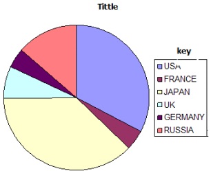
This is use of circles of various sizes to represent different sets of statistical data
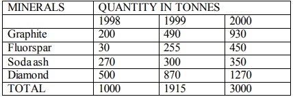
Table showing mineral production In Kenya from year1998-2000

major mineral producing countries-Geo Form Three

Steps
1. Determining the radii of circles by finding the square roots of the totals
1998 √1000 = 31.62 = 32
1999 √1915 = 43.76 = 44
2000 √3000 = 54.77 = 55

2. Scale:1cm represents 10 tonnes
1998 = 3.2 cm
1999 = 4.4 cm
2000 = 5.5 cm

3. Using a pair of compasses draw circles of different radii representing mineral production in Kenya between 1998 and 2000.

4. Convert component values into degrees
Component value/ total value of data X 360
1998: Graphite - 200/1000 X 360 = 72°
Fluorspar - 30/1000 x 360 = 10.8°
Soda ash - 270/1000 x 360 = 97.2°
Diamond - 500/1000 x 360 = 180°
1999: Graphite - 490/1915 x 360=92.1°
Fluorspar - 255/1915 x 360 = 47.9°
300/1915 x 360 = 56.4°
Diamond-870/1915 x 360 = 163.6°
2000: Graphite - 930/3000 x 360 = 11.6°
Fluorspar - 450/3000 x 360 = 54°
Soda ash - 350/3000 x 360=42.1°
Diamond - 1270/3000 x 360=152.3°

5. On the proportional circle for each year use a protractor and mark out the angles
6. Shade the segments and then provide a key.

Advantages
1. They give a good visual impression.
2. Easy to compare various components.
3. Simple to construct.
4. Easy to interpret as segments are arranged in descending order.
5. Can be used to present varying types of data.

Disadvantages
1. Tedious in calculation and measurement of angles
2. Actual values represented by each component cant be known at a glance
3. Difficult to accurately measure and draw sectors whose values are too small.
4. Comparison can be difficult if the circles represent values which are almost equal.

Analysis/Conclusions
1. Diamond was leading in production.
2. The second leading mineral in production was graphite.
3. The mineral with the lowest production was fluorspar.

Hello Guest, Please help review these notes.    Why review

Your review has been successfully submitted.
Tell us what you think about the notes.

Submit Comment